
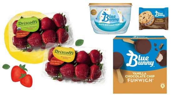
Many months ago I was grocery shopping and standing in front of the ice cream section pondering what cream flavor of goodness would win when I noticed the new packaging from Blue Bunny.
I was immediately surprised by it’s almost stark design style, especially in a merchandising case that is filled with so much visual tasty fun. I mean you’ve seen Ben & Jerry’s ice cream right? (It’s OK if you are secretly thinking – no I didn’t look at the container out of shame after I ate the whole thing and threw away the evidence.)
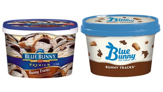
When you put the new design next to the old design you quickly realize that they are dramatically different. Not only has the logo changed, but the entire style of the coloring, artwork and tone of the packaging has changed.
What became blatantaly clear about the power of the rebranding of Blue Bunny is the visual greatness of the merchandising. Whether we love or hate new branding, what sometimes is the great equalizer is its power on shelf. Consumers spend less than 7 seconds looking at a category before they decide what to buy. They need to quickly cut through the clutter and find what they are looking for or be inspired by something that visually jumps off the shelf.

I didn’t love the new branding, but I was in love with how easy it was to find the products and how clean and uncluttered the selection process had become. Just look at the transformation and then look at what the traditional competitive set looks like. This branding was winning the shelf – at least in my opinion.
Although I saw the Blue Bunny refresh months ago I was reminded of it again today when I saw Driscoll’s new berry packaging rebranding. They too have taken a less is more approach to branding in their packaging redesign. They don’t have dozens of competitors to win competition from, but they fight for share of stomach with other fresh produce. Part of their reasoning for change was to adapt a more consistent global brand. As a mere coincidence, this announcement was made the same day that a new study was published that showed that consumers want less packaging in fresh produce. Although the amount of packaging didn’t change, simply placing less priority on the branding and more emphasis on the fruit creates the impression of product first.

There are many reasons for rebranding and our brands are powerful tools used to build our product and name awareness and gain advantage over our competitors. Use your space wisely.
If you are considering a brand refresh drop us an email and we’ll discuss why a brand refresh can work for you.
Written by Melinda Goodman
Managing Partner
Melinda@FullTiltMarketing.net
